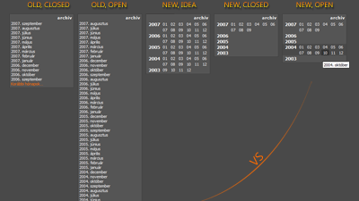
As you can see, it spares a lot of space and it doesn't screw up the page layout when opened. This menu structure has been achieved by using a two level unordered list (standard semantic blind friendly xhtml) and some pretty heavy css usage. The underlying php script needed only a tiny tweak, 'cause the month list was already generated by a generic function.
What you can't see on this image is that, in my opinion, it's really ergonomic. You can point to the month of your choice really fast (because the list is clean and short, there is absolutely no clutter), and the whole hide-and-show thing works just like someone would expect.
Sorry for my English, I'm just practising.


